Pump it
Display chrome
Futura Condensed PT licensed
Barlow Condensed free fallback
Headlines, nav, section headers, result moments, all brand chrome. Always uppercase, always italic.
Historical source catalogue. Current DS · Live React components. Specimen code below is reference material, not the current React API.
… components, … tokens, … pages, reverse-engineered from the original artwork and cross-checked against the running product, measurement by measurement. Nothing here is estimated from a screenshot.
Four ways in. Everything is measured off the artwork or read out of the running code each card says how much is in there.
Colour in two palettes, the type ramp, the shadow scale and the sizing table. Click any swatch to copy it.
Go to tokens → …ComponentsEvery component with a preview, its measurements, its Figma page and a download. Filter by atomic level or domain.
Go to components → …PagesEvery screen at full resolution with its component anatomy mapped on top, click a region to open the component.
Go to pages →Current token values match the September 29 handoff. This catalogue preserves historical geometry and CSS specimens; use the React workbench for the current API and states.
Three roles, three faces. Don't collapse them, that is the mistake
analysis/TYPOGRAPHY.md leads with, and it is the authority here.
Pump it
Futura Condensed PT licensed
Barlow Condensed free fallback
Headlines, nav, section headers, result moments, all brand chrome. Always uppercase, always italic.
Will BTC close above 100K?
Futura PT licensed
Inter free fallback
Market questions, body copy, descriptions, form labels. Everything a person reads as a sentence.
$48,120.00
JetBrains Mono free, no licence needed
ui-monospace system fallback
Prices, wallet addresses, volumes, timestamps, IDs, ledger rows. Values, and nothing else.
No font files ship in this kit, on purpose. Futura PT and Futura Condensed PT are licensed to Pumpcade and that licence does not travel in a zip, each studio buys its own (Adobe Fonts, or Paratype / MyFonts) or uses the fallbacks. A layout built entirely on Barlow Condensed + Inter + JetBrains Mono is on-brand; the Figma library is set that way already. Another geometric sans, Poppins, Montserrat, Century Gothic, is not: it breaks the proportions the system is tuned to.
That slant matches the wordmark's 12° lean, the single strongest type signal in the system.
Every all-caps label. Caps set without tracking looks broken at small sizes.
font-variant-numeric: tabular-nums on prices, odds, countdowns, balances
anything that can change under you.
Body copy set in JetBrains Mono is the most common Pumpcade type mistake. It makes every sentence read as terminal output and flattens the hierarchy.
Hard offset, zero blur, always down-right. The scale comes from code usage frequency, not from the artwork.
Six durations, four easings, one distance, each earned by how often it
occurs in the product's own source, not chosen. Three things are deliberately absent and
the reasons are in analysis/SPEC_MOTION.md: nothing rotates, nothing springs,
and no component animates on mount.
Reduced motion is a standard we raise, not one we inherit. The product respects the preference in under half its CSS and in 2 of its 28 motion modules 7%. On a market that flashes and sweeps on the money path, everything here stops instead.
The system had … components and no layout layer, no grid, no bands, no spacing rhythm. Everything here is measured from all 30 artwork frames rather than chosen.
The artwork draws exactly two widths and nothing between them, and the rule it follows is that the stage is the width of the nav bar, confirmed on 15 of 15 desktop frames. 768–1279 is undrawn: the code switches to two columns there, a state nobody drew.
| Desktop | Mobile | |
|---|---|---|
| Frame | 1920 | 478 |
| Stage | 1820 | 412 |
| Outer margin | 50 | 32 |
| Top margin | 40 | 18 |
No column grid, a ladder of bands. Every page in the product hand-typed its own container instead: eight different max-widths in code, none of them 1820.
| Token | px | Measured from |
|---|---|---|
band/bleed | 1857 | TickerMarquee; landing places it x34 to x1891 |
band/stage | 1820 | TopNav, and the stage IS the width of the nav bar, on 15 of 15 |
band/wide | 1650 | ActivityRow; the 3-up card band measures 1641-1647 |
band/pair | 1569 | SummaryBar; profile 2-up = 2x775 + 19 |
band/body | 1428 | PriceChart; single-market body x272 to x1700 |
band/section | 1007 | TableHeader, Masthead, TicketPanel, ErrorPanel, all exactly 1007 |
band/inline | 491 | SearchField = StakeInput = Field |
band/stage-mobile | 412 | MobileHeader, which replaces TopNav entirely on all 13 mobile frames |
A second spacing scale, deliberately. space/1–9 in the
Sizing table above is intra-component padding, a generic 4-based scale that was never
measured. This one is the gap between regions on a page, and it is. They overlap at
8, 16, 24 and 32; where they differ this one wins for composition, because 40 is the page top
margin on 15 of 15 frames and 68 is the grid gutter, and neither exists in the padding scale.
44, 47, 49, 52, 70 and 95 occur once each and are rejected as drift; 30 and 36 are list-row
pitches, not region gaps.
The Meme Madness pages draw on a fixed 1440 stage with a 40px outer margin (content x40 → x1400, a 12-column rhythm) and a 480 mobile stage on 18px margins (4 columns). Toggle the overlay to see the columns against real page anatomy.
The same 118 tokens, generated straight from the Figma library, in three formats.
The Artwork palette is the default; [data-palette="production"] switches the
whole set to what globals.css ships today.
Every colour, size, type step and shadow as --pc-*, with a production override block and mobile sizing under a media query.
The standard interchange format, feed it to Style Dictionary or any token pipeline. Current source values are generated in one compatible consumer format.
Download tokens.w3c.json → TWTailwind themeColours, spacing, font sizes and the comic shadow scale, shaped for theme.extend.
… entries. Grouped by what a thing is, not by an atomic level, the artwork is not built bottom-up, so atoms/molecules/organisms produced 863×621 “atoms” and catalogued the same box twice. Surface is the one that matters most: the drawn plate on its own, ready for your content.
Every component opens with a Download SVG, a Download shape and a
copyable source pane. If you'd rather have the lot in one go, take a zip. Shapes are the
silhouettes with every text layer and every clip-path texture stripped out, the frame on its own,
ready for your own copy. Reapply the dots with the halftone <pattern> primitives.
Text and texture removed, comic shadows rewritten as feDropShadow. Averages 3 KB a file, the Burst drops from 27 KB to 2.3 KB this way.
The primitives and icons exactly as they are in Figma, halftone patterns, ribbon segments, trend arrows, the logo.
Download pumpcade-svg.zip → CSSTokens to matchThe shapes carry their own fills, but the surrounding type, spacing and shadow scale live in the token exports.
Go to tokens →… glyphs, everything the artwork and the Meme Madness pages use, normalised to a 32 grid, recolourable, one file each. Click a tile to copy the SVG markup; use the buttons to download. Icons ship as vectors only.
Every screen in the source file at full resolution, 17 desktop pages up to 1922 × 2537 and 13 mobile, not thumbnails. Open one and you get the page at its real size with its anatomy mapped on top: the components the system actually accounts for, positioned where they sit in the artwork. Click any of them to jump straight to the component.
State coverage against the running product is
tracked in site/data/coverage.json and in analysis/. It answers a
planning question, what the product ships that the artwork never drew, so it is not part of
what a consumer of this system needs on the page.
The current set, one route each, every one desktop 1440 and mobile 480 in the same file, set in the product's own faces (Futura PT Cond, Futura PT, JetBrains Mono) and its production tokens. The Prediction Arcade is the homepage: three market categories, a category rail in the client's SportsTab language, a category glyph in every ribbon, one card for all of it, two colourways from one source. Live markets is the in-app generic view. Football is the first sports game centre: the broadcast field with the play drawn on it from the play-by-play feed, the pick, the drive, the five states, the motion timed in the production numbers, every fill named in pcColor. Profile is the redesign of the screen the client asked about. The Cade Cup board is the NFL playoff bracket with a live game on it. States & flows is the system's own reference sheet. Earlier passes and the Meme Madness campaign pages live in the archive.
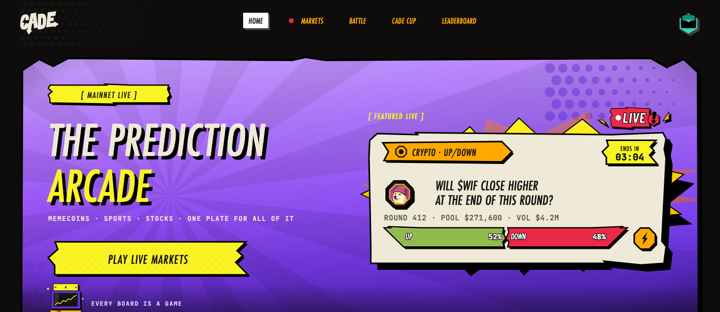
The Prediction Arcade · homepage
Open ↗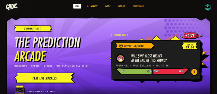
The Arcade · dark colourway
Open ↗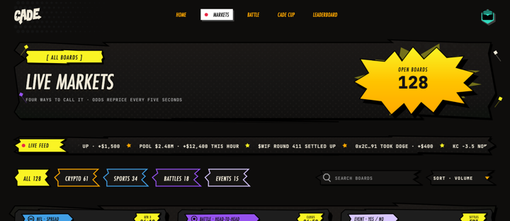
Live markets · the generic view
Open ↗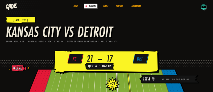
Football · the game centre
Open ↗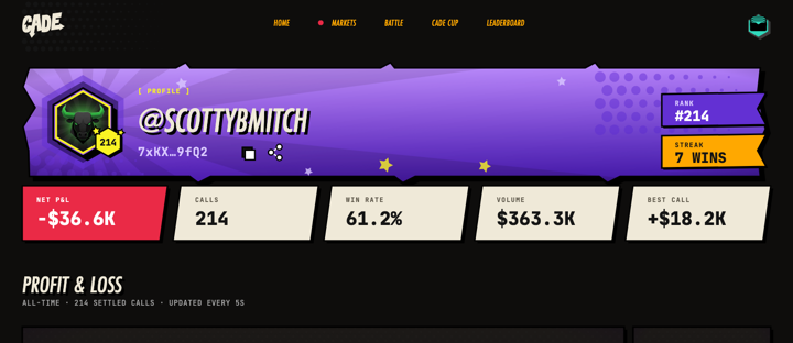
Profile · redesign
Open ↗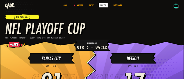
Cade Cup · the NFL playoff board
Open ↗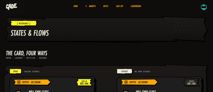
States & flows
Open ↗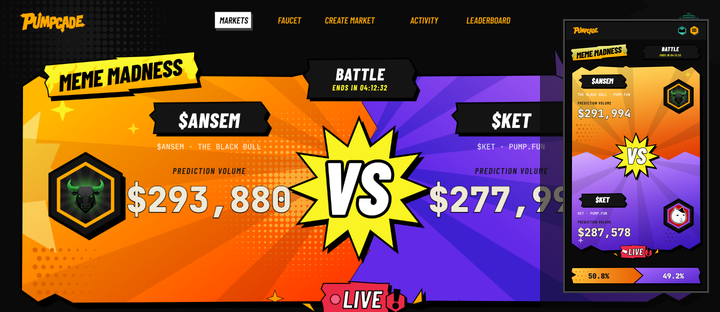
Archive · earlier passes
Open ↗The 19 components these screens are built from, every one of them lives in the library as a real component, not a screenshot. Click any tile to open it in Components.
The official brand library, pulled from the product's own
app/assets/brand/v1, not redrawn from artwork. … files in
… families, most of them in five colourways: default, black, white, orange
and outline. Click any tile to download the SVG.
The second mark in the family: Cade, the prediction-arcade sub-brand. A single C cut from the same bolt-in-counter logic as the Pumpcade wordmark, plus the profile images and the banner set it ships with. Two colourways throughout, arcade orange and the violet used on the battle field.
The counter is a bolt. It reads as a C at signature size and as a lightning strike at app-icon size, the reason this direction was chosen over the three earlier explorations.